torsdag 2 april 2015

Final Analysis of our Project

In this post I would like to add some final points about our prototype.

Our final prototype followed many of the suggestions proposed in Chapter 2. First of all, we kept in mind that a change at an early stage is better than when code has already been written. As it can be seen below, the layout changed drastically thanks to the fact that it was a prototype. Secondly, the prototype uses metaphors and analogies. For example, the notion of Treasure hunt and Quiz is supposed to allow users to relate to physical actions. Moreover, the sound icon relates to a physical object that is associated with sound (i.e. a speaker), for instance. In addition, the layout has a repetitive aspect to it. All pages have a standard layout consisting of two toolbars, one at the top and one at the bottom. Finally, most importantly, as suggested in chp. 2., the layout uses common pattern libraries. For instance, the current design is inspired by Bootstrap elements (mobile first responsive design) so that the user will feel confident at the first time of use.

The data gathering process was structured according to the recommendations in chp.7 also. We went into the field (the museum visit), asked visitors semi-structured interview questions, and performed think alouds in order to be able to reiterate the design. I think we applied the Grounded Theory mostly, since we followed the “collect data -> establish theory by analysis -> collect data based on analysis”.

The final point that can be added to the prototype design is the fact that its interface is adjusted to the task (as suggested in the chapter about establishment of theory).  This was achieved using the personas we had (and the scenarios), since our was to reach a larger audience.


lördag 28 mars 2015

Course Theory and our Project

This blog post aims to explain from my perspective how the course theory influenced our project and the final design of the prototype. We would read theory from the book and apply that knowledge through frameworks and suggestions the book had to offer. All page numbers and chapters reference to the 1st edition of Interaction Design: Beyond Human-Computer Interaction).

We started off by conceptualising the problem space by attempting to answer the following questions: (Ch 2, page 38)
  • Are there problems with the existing solution (if that solution exists) ?
  • Why do you think your proposed idea is useful? 
  • How will your proposed design support people in their activities ?
This was a useful framework that the book suggested and we managed to solve those questions throughout our project.

We also used the conceptual model based on activities, mainly when we were designing and coding the prototype. This conceptual model involved the user performing activities such as: (Ch 2, page 41)
  • instructing 
  • conversing
  • manipulating and navigating
  • exploring and browsing

With this model, we identified the main interaction a user would have with the app. Those  activities were manipulating and navigating as well as exploring and browsing. This is because our app involves users interacting with information and navigating through different pages. There was no form of instructions the user could give the app nor was there any conversing with the app.

Theory from chapter 3 (Understanding Users) helped us deal with the psychology perspective of the app. The idea of cognition (Ch 3, page 74)  is important when designing an app like ours because we wanted users to feel engaged and to pay attention while exerting as little brain power as possible. When I coded the prototype, I kept in mind that small details such as how the placement of buttons can affect a user's interaction with the app. One issue in the first version of the prototype was a back button I implemented. The button allowed you to return to the previous page. The problem with this button was the way our pages were set 
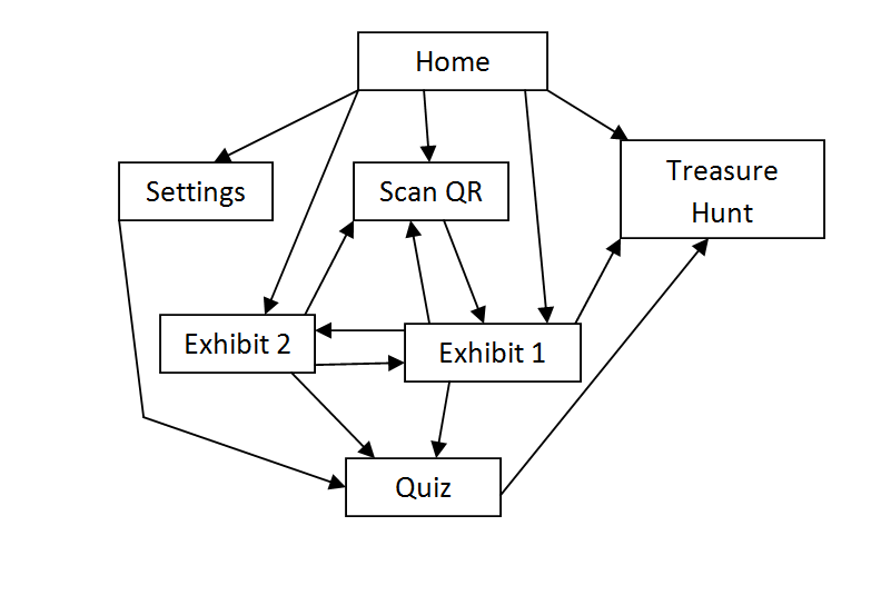
up. A hierarchy of the pages looks like this:


The issue with the back button was that a user had to press it excessively to return to the home page. The page layout is not linear but it is more like a web. There are several links one can use to access different pages (such as buttons). If a user were to navigate through ten pages for example, they would have to press the back button ten times to return home. When we tested users and performed a think aloud evaluation, this was a common issue that the users would complain about. To fix this, I replaced the back button with a home button which reduced the time it takes to return to the home page.

Information presentation (Ch 3, page 76) was also a key influence to the prototype because of the app's reliance on text based information. To ensure that everything was easy to read, font sizes and spacing was applied in an appropriate manner.

In chapter 5 (Understanding how interfaces affect users), one particular aspect that we could relate to was user frustration. All of us at some point have experienced frustration with an app and this can cause a user to stop using it all together (especially if there are better alternatives out there). The theory provided several main causes of user frustration such as gimmicks, error messages, overburdening the user and appearance.(Ch5, pages 148-153) The main sources of frustration that was concentrated upon was gimmicks and the appearance. Some gimmicks popped up in our user testing such as the "select language" button which did not actually change the language. However, coding several languages into the prototype takes time and this was only a prototype so this was not too much of an issue. However, the quiz had a flaw where it would  provide a pop-up saying "Correct Answer" when a user selected any answer. This lead them to a false sense of achievement until they realised the bug. This section on user frustration helped us identify issues that users commonly have and helped us prevent those issues from appearing in the final design.

In our exercise, we combined our conventional and non-conventional prototypes and in this process, we were able to identify the main requirements the app would need to fulfil. On page 207, "A user may be a novice, an expert, a casual or a frequent user" was a useful quote because it made me realise the importance of the user's skills. If we make the app too complex, it could be difficult for novices such as children and old people to understand the features. If the app was designed to be too simplistic with constant reminders on how to use the app, more advanced users may not find it as appealing to use. The aim was to instead, create something with a simplistic interface but if the user needed help, they could rely on the panel page. This page is opened by a button labelled "help" located at the top right of the home page. This way, a more advanced or frequent user who is familiar with the interface won't be annoyed by reminders on how to use the app.

There were several methods of obtaining data (questionnaires, interviews, workshops, natural observation and studying documentation) but we only used a select few. (Ch7, page 211) I believe that the most applicable form of data gathering was questionnaires and natural observation. Interviews are good to get in-depth analysis but finding willing participants would have been difficult. Questionnaires is what we used and participants would give us or short statements for their answers. Natural observation worked to a certain extent because we could observe physical interaction within the museum (a person interacting with a device). However the user's thought processes are harder to determine this technique.

Compromises in prototyping (Ch 8, page 246) is something that popped up when deciding how far the features were meant to be implemented. For example, the select language button simulates what it would be like to select the language but does not actually change it. We wanted to focus more on the design rather than implementing 6 different languages which could be done when the app actually gets made.

The evaluation paradigm we used was the "quick and dirty" paradigm . In the evaluation process, we just gave participants the prototype and wanted to see if they could figure it out for themselves. We did not use the usability testing paradigm because we would be controlling the evaluation. By having the users evaluating the app for themselves, they are able to spot potential flaws that we may have overlooked. (Ch 11, pages 340-343)


torsdag 26 mars 2015

A Final Meeting until Monday Presentation

Hi guys!

First of all, I would like to congratulate all of you that our prototype was selected to be presented on the final presentation on Monday next week.

Meeting on Friday (tomorrow) 10:00-12:00

We already have a good presentation, but as Jonas stressed during the last session, focus should be put on the marketing aspect. That is, we should convince the museum stuff (they will constitute a part of the jury).
  • 10:00 - 12:00, Friday 27/3. Room 7, Dürer. KTH Library.
The presentation is available here:

Preparation for the Meeting

  • Go through the presentation
  • Search for relevant images/graphs/tables (anything with numbers that proves our point).
  • Think about other things that can be added to convince the audience.

App prototype

  • The bugs can be fixed.

Summary

Short conclusion: We have to win!

måndag 23 mars 2015

Preperation for Final Presentation

Good work everyone ! By next week, the prototype will be improved. But in order for that to happen, I will need:


  •  a list of changes that need to be made (solutions to the bugs).
  •  a suggestion for a colour theme.
  •  a name for our app, app icon is optional.
Here is an updated version of the prototype, fixed the quiz bug, implemented a home button. Changed the home page theme (if we agree that it works, I will then do the same theme on the rest of the pages)

söndag 22 mars 2015

The presentation tomorow

As you all might know, tomorrow we are to present our prototype that we've worked on for the entire term. Here's the plan:

Meeting up at 13:00

  • I've already booked the room no. 3 (called  Scheele) in the library. We have till 15:00.
Presentation
  • A new presentation is now available. It's not entirely done, but at least the layout and some basic things are there.
  • See it here
See you tomorrow!

måndag 9 mars 2015

thinking aloud with martin nilsson

I had a 21 year old woman from Germany perform the think-aloud.  While not exactly a thespian (experienced or otherwise), I felt her artistic background put her as close to our “crazy persona” as a social reject like me could manage to dig up.

I served her the mandatory disclaimer: Prototype is a prototype and has limited functionality. (This had to be repeated several times throughout the process. Complaints about functionality have been included anyway in the name of completeness. Also it was pretty funny.) I further explained what the intended purpose of the product was, etc., providing some context to the abstract implementation of the application.

QUIZ:
Right out of the gate, she made fun of the grammar mistake in the first question. She exclaimed she was a genius when she got the second question right, but I had to explain how the thing is just bugged and you can’t actually fail any subsequent question if you pass the firs. A crippling blow to her confidence, but we powered on. Finally, she voiced some miscellaneous issues regarding the specific questions chosen. Ultimately, however, there was not much usable intel.

QR-SCANNER:
So she pressed the QR-code and got to the rocket info, which she wasn’t really interested in, and because of some misaligned text didn’t realize the Aeroplane picture linked to ANOTHER exhibit, but I told her it was and she said Oh.

SETTINGS:
She didn’t know what the Clear Exhibits button did and frankly neither did I. She wanted to change the language to her native Latvian but quickly figured out it doesn’t actually work and promptly began criticizing me for it.

OVERALL:
With the limited functionality in mind, there wasn’t a whole lot for her to reflect on. She said the overall idea was cool, though, and that as long as the information from the app acts as a supplement, rather than a replacement, it’d be a welcome addition to her museum experience. She was positive toward both the idea of treasure hunting and answering quizzes.

As a finale to the entire thing, she left me with a quote. I suspect this quote is a bit of a jab at the limited functionality but, again, for completeness, I will include this too: “It accomplished absolutely none of the parameters set out by the project unless those parameters were to make the least functional and useful webpage ever.”

Think Aloud - Artem

I performed the experiment on an old lady. I introduced her to the setting, i.e. a museum, and that this is an app installed on her smartphone, and that she should tell me everything she thinks about.

In the beginning, there were some difficulties to understand what to do, partly due to the fact that it was in English. I told her to navigate to the help page, she was able to interpret the instructions and navigate back to the main page.

It was confusing to get the point of the main screen that said “scan an IR code”. She tried to click on the text but it did not work. I guided her to press on the QR scan button, and then I told her that this is actually available at every exhibit (a code). She pressed on the code and got to the page with the rocket exhibit. Later she pressed on the aircraft exhibit and then I told her to try to go the home page. Everything worked out perfectly.

She was able to change the language (although I had to explain that it isn't supposed to work). Later, I told her to take a Quiz and as a result, she was quite happy since she got all questions right! She tried the "treasure hunt", but again, I had to explain the way it works since it is currently just an idea.


In the end I asked her to give me some quick feedback and tell me about her user experience. She said that this is not difficult to understand, but it [interface] requires some time to get used to. If it would be in her mother tongue, it would be easier according to her.