torsdag 2 april 2015

Final Analysis of our Project

In this post I would like to add some final points about our prototype.
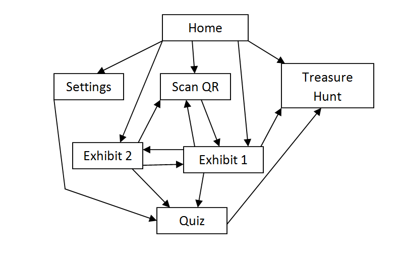
Our final prototype followed many of the suggestions proposed in Chapter 2. First of all, we kept in mind that a change at an early stage is better than when code has already been written. As it can be seen below, the layout changed drastically thanks to the fact that it was a prototype. Secondly, the prototype uses metaphors and analogies. For example, the notion of Treasure hunt and Quiz is supposed to allow users to relate to physical actions. Moreover, the sound icon relates to a physical object that is associated with sound (i.e. a speaker), for instance. In addition, the layout has a repetitive aspect to it. All pages have a standard layout consisting of two toolbars, one at the top and one at the bottom. Finally, most importantly, as suggested in chp. 2., the layout uses common pattern libraries. For instance, the current design is inspired by Bootstrap elements (mobile first responsive design) so that the user will feel confident at the first time of use.
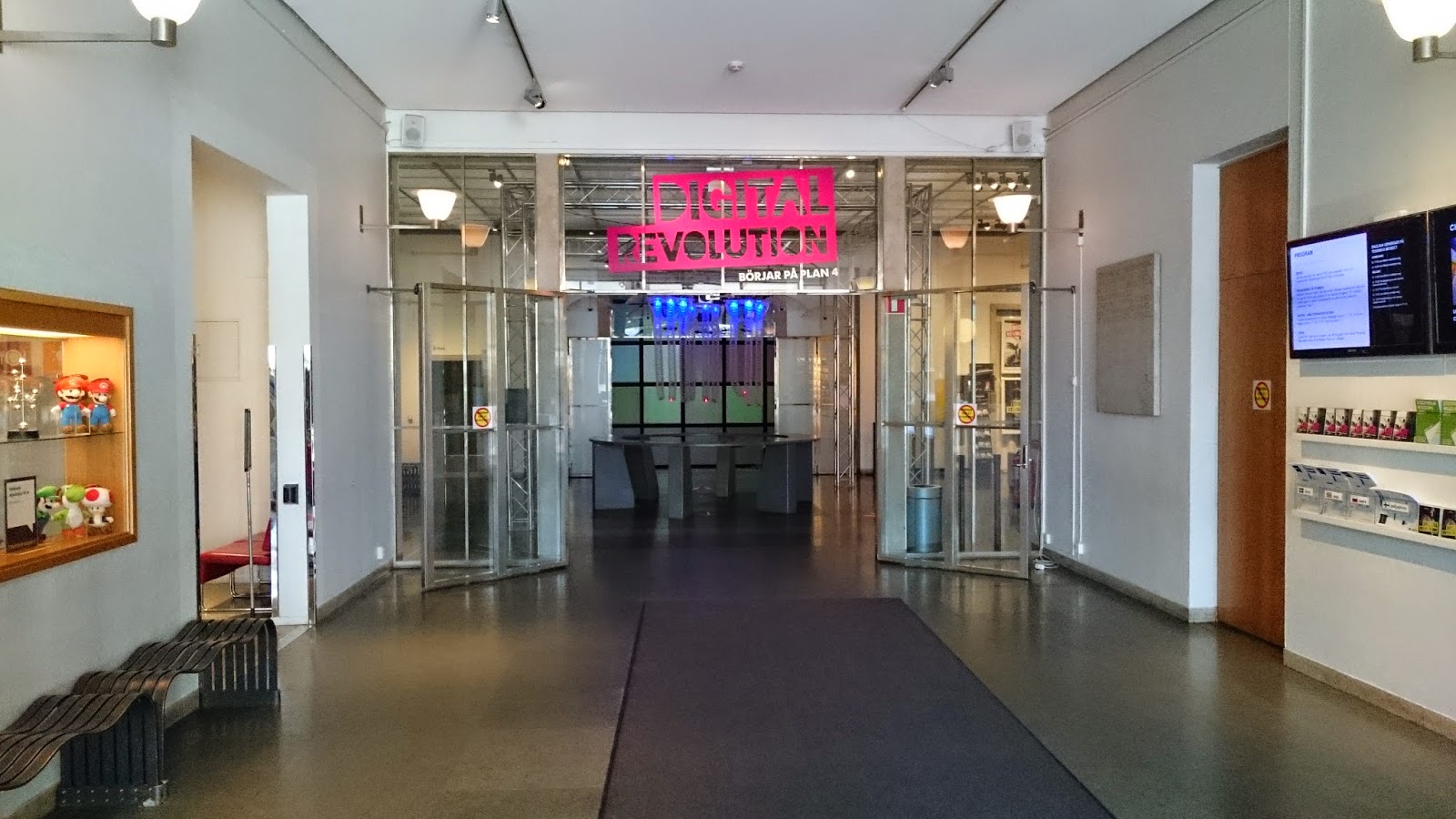
The data gathering process was structured according to the recommendations in chp.7 also. We went into the field (the museum visit), asked visitors semi-structured interview questions, and performed think alouds in order to be able to reiterate the design. I think we applied the Grounded Theory mostly, since we followed the “collect data -> establish theory by analysis -> collect data based on analysis”.

The final point that can be added to the prototype design is the fact that its interface is adjusted to the task (as suggested in the chapter about establishment of theory).  This was achieved using the personas we had (and the scenarios), since our was to reach a larger audience.


lördag 28 mars 2015

Course Theory and our Project

This blog post aims to explain from my perspective how the course theory influenced our project and the final design of the prototype. We would read theory from the book and apply that knowledge through frameworks and suggestions the book had to offer. All page numbers and chapters reference to the 1st edition of Interaction Design: Beyond Human-Computer Interaction).

We started off by conceptualising the problem space by attempting to answer the following questions: (Ch 2, page 38)
  • Are there problems with the existing solution (if that solution exists) ?
  • Why do you think your proposed idea is useful? 
  • How will your proposed design support people in their activities ?
This was a useful framework that the book suggested and we managed to solve those questions throughout our project.

We also used the conceptual model based on activities, mainly when we were designing and coding the prototype. This conceptual model involved the user performing activities such as: (Ch 2, page 41)
  • instructing 
  • conversing
  • manipulating and navigating
  • exploring and browsing

With this model, we identified the main interaction a user would have with the app. Those  activities were manipulating and navigating as well as exploring and browsing. This is because our app involves users interacting with information and navigating through different pages. There was no form of instructions the user could give the app nor was there any conversing with the app.

Theory from chapter 3 (Understanding Users) helped us deal with the psychology perspective of the app. The idea of cognition (Ch 3, page 74)  is important when designing an app like ours because we wanted users to feel engaged and to pay attention while exerting as little brain power as possible. When I coded the prototype, I kept in mind that small details such as how the placement of buttons can affect a user's interaction with the app. One issue in the first version of the prototype was a back button I implemented. The button allowed you to return to the previous page. The problem with this button was the way our pages were set up. A hierarchy of the pages looks like this:


The issue with the back button was that a user had to press it excessively to return to the home page. The page layout is not linear but it is more like a web. There are several links one can use to access different pages (such as buttons). If a user were to navigate through ten pages for example, they would have to press the back button ten times to return home. When we tested users and performed a think aloud evaluation, this was a common issue that the users would complain about. To fix this, I replaced the back button with a home button which reduced the time it takes to return to the home page.

Information presentation (Ch 3, page 76) was also a key influence to the prototype because of the app's reliance on text based information. To ensure that everything was easy to read, font sizes and spacing was applied in an appropriate manner.

In chapter 5 (Understanding how interfaces affect users), one particular aspect that we could relate to was user frustration. All of us at some point have experienced frustration with an app and this can cause a user to stop using it all together (especially if there are better alternatives out there). The theory provided several main causes of user frustration such as gimmicks, error messages, overburdening the user and appearance.(Ch5, pages 148-153) The main sources of frustration that was concentrated upon was gimmicks and the appearance. Some gimmicks popped up in our user testing such as the "select language" button which did not actually change the language. However, coding several languages into the prototype takes time and this was only a prototype so this was not too much of an issue. However, the quiz had a flaw where it would  provide a pop-up saying "Correct Answer" when a user selected any answer. This lead them to a false sense of achievement until they realised the bug. This section on user frustration helped us identify issues that users commonly have and helped us prevent those issues from appearing in the final design.

In our exercise, we combined our conventional and non-conventional prototypes and in this process, we were able to identify the main requirements the app would need to fulfil. On page 207, "A user may be a novice, an expert, a casual or a frequent user" was a useful quote because it made me realise the importance of the user's skills. If we make the app too complex, it could be difficult for novices such as children and old people to understand the features. If the app was designed to be too simplistic with constant reminders on how to use the app, more advanced users may not find it as appealing to use. The aim was to instead, create something with a simplistic interface but if the user needed help, they could rely on the panel page. This page is opened by a button labelled "help" located at the top right of the home page. This way, a more advanced or frequent user who is familiar with the interface won't be annoyed by reminders on how to use the app.

There were several methods of obtaining data (questionnaires, interviews, workshops, natural observation and studying documentation) but we only used a select few. (Ch7, page 211) I believe that the most applicable form of data gathering was questionnaires and natural observation. Interviews are good to get in-depth analysis but finding willing participants would have been difficult. Questionnaires is what we used and participants would give us or short statements for their answers. Natural observation worked to a certain extent because we could observe physical interaction within the museum (a person interacting with a device). However the user's thought processes are harder to determine this technique.

Compromises in prototyping (Ch 8, page 246) is something that popped up when deciding how far the features were meant to be implemented. For example, the select language button simulates what it would be like to select the language but does not actually change it. We wanted to focus more on the design rather than implementing 6 different languages which could be done when the app actually gets made.

The evaluation paradigm we used was the "quick and dirty" paradigm . In the evaluation process, we just gave participants the prototype and wanted to see if they could figure it out for themselves. We did not use the usability testing paradigm because we would be controlling the evaluation. By having the users evaluating the app for themselves, they are able to spot potential flaws that we may have overlooked. (Ch 11, pages 340-343)


torsdag 26 mars 2015

A Final Meeting until Monday Presentation

Hi guys!

First of all, I would like to congratulate all of you that our prototype was selected to be presented on the final presentation on Monday next week.

Meeting on Friday (tomorrow) 10:00-12:00

We already have a good presentation, but as Jonas stressed during the last session, focus should be put on the marketing aspect. That is, we should convince the museum stuff (they will constitute a part of the jury).
  • 10:00 - 12:00, Friday 27/3. Room 7, Dürer. KTH Library.
The presentation is available here:

Preparation for the Meeting

  • Go through the presentation
  • Search for relevant images/graphs/tables (anything with numbers that proves our point).
  • Think about other things that can be added to convince the audience.

App prototype

  • The bugs can be fixed.

Summary

Short conclusion: We have to win!

måndag 23 mars 2015

Preperation for Final Presentation

Good work everyone ! By next week, the prototype will be improved. But in order for that to happen, I will need:


  •  a list of changes that need to be made (solutions to the bugs).
  •  a suggestion for a colour theme.
  •  a name for our app, app icon is optional.
Here is an updated version of the prototype, fixed the quiz bug, implemented a home button. Changed the home page theme (if we agree that it works, I will then do the same theme on the rest of the pages)

söndag 22 mars 2015

The presentation tomorow

As you all might know, tomorrow we are to present our prototype that we've worked on for the entire term. Here's the plan:

Meeting up at 13:00

  • I've already booked the room no. 3 (called  Scheele) in the library. We have till 15:00.
Presentation
  • A new presentation is now available. It's not entirely done, but at least the layout and some basic things are there.
  • See it here
See you tomorrow!

måndag 9 mars 2015

thinking aloud with martin nilsson

I had a 21 year old woman from Germany perform the think-aloud.  While not exactly a thespian (experienced or otherwise), I felt her artistic background put her as close to our “crazy persona” as a social reject like me could manage to dig up.

I served her the mandatory disclaimer: Prototype is a prototype and has limited functionality. (This had to be repeated several times throughout the process. Complaints about functionality have been included anyway in the name of completeness. Also it was pretty funny.) I further explained what the intended purpose of the product was, etc., providing some context to the abstract implementation of the application.

QUIZ:
Right out of the gate, she made fun of the grammar mistake in the first question. She exclaimed she was a genius when she got the second question right, but I had to explain how the thing is just bugged and you can’t actually fail any subsequent question if you pass the firs. A crippling blow to her confidence, but we powered on. Finally, she voiced some miscellaneous issues regarding the specific questions chosen. Ultimately, however, there was not much usable intel.

QR-SCANNER:
So she pressed the QR-code and got to the rocket info, which she wasn’t really interested in, and because of some misaligned text didn’t realize the Aeroplane picture linked to ANOTHER exhibit, but I told her it was and she said Oh.

SETTINGS:
She didn’t know what the Clear Exhibits button did and frankly neither did I. She wanted to change the language to her native Latvian but quickly figured out it doesn’t actually work and promptly began criticizing me for it.

OVERALL:
With the limited functionality in mind, there wasn’t a whole lot for her to reflect on. She said the overall idea was cool, though, and that as long as the information from the app acts as a supplement, rather than a replacement, it’d be a welcome addition to her museum experience. She was positive toward both the idea of treasure hunting and answering quizzes.

As a finale to the entire thing, she left me with a quote. I suspect this quote is a bit of a jab at the limited functionality but, again, for completeness, I will include this too: “It accomplished absolutely none of the parameters set out by the project unless those parameters were to make the least functional and useful webpage ever.”

Think Aloud - Artem

I performed the experiment on an old lady. I introduced her to the setting, i.e. a museum, and that this is an app installed on her smartphone, and that she should tell me everything she thinks about.

In the beginning, there were some difficulties to understand what to do, partly due to the fact that it was in English. I told her to navigate to the help page, she was able to interpret the instructions and navigate back to the main page.

It was confusing to get the point of the main screen that said “scan an IR code”. She tried to click on the text but it did not work. I guided her to press on the QR scan button, and then I told her that this is actually available at every exhibit (a code). She pressed on the code and got to the page with the rocket exhibit. Later she pressed on the aircraft exhibit and then I told her to try to go the home page. Everything worked out perfectly.

She was able to change the language (although I had to explain that it isn't supposed to work). Later, I told her to take a Quiz and as a result, she was quite happy since she got all questions right! She tried the "treasure hunt", but again, I had to explain the way it works since it is currently just an idea.


In the end I asked her to give me some quick feedback and tell me about her user experience. She said that this is not difficult to understand, but it [interface] requires some time to get used to. If it would be in her mother tongue, it would be easier according to her.

Think Aloud - Robin Bråtfors

I performed the think aloud with a 11 year old boy who is very interested in cars and mobile games. His interests, age and knowledge is similair to our primary persona and I think he's a fitting test user. He has experience with quiz apps such as "Quizkampen", but he has never used a QR code. His english knowledge seemed to be sufficient.

I explained the context of the app, how it will be used and what happens if you press different buttons. But I wanted him to mostly explore by himself and so I set up a scenario (a museum visit) to immerse in him in the experience.

The first thing he did was to click on help, he didn't understand everything but he told me he got the gist of it. Then he decided to take the quiz but after answering the first question, it took a few seconds for him to realise there were more questions if you scrolled. When he had answered all the questions he wondered what he was supposed to do next, so I had to tell him that there was no "game over" screen or score board implemented yet.

So he moved onto the QR scanning, he didn't know what QR was but he realised that the code was clickable when he moused over it. I explained how QR worked and it would be implemented later on.

After that, he clicked on the treasure hunt and realized he had to use the scan function to complete it, he clicked on the QR scan and was dissapointed when he got the rockets exhibit again.

So he ignored it and decided to explore the settings. He noticed that the language change didn't do anything and I told him that it wasn't fully implemented yet. Then he clicked on the "clear exhibits" button and I told him about the checklist function, which shows all the exhibits you've scanned on the "home screen", and that he had just cleared all his history.

Because of that, he wannted to take a look at the home screen but he
was confused by the lack of a home button and frustrated when I told him he had to press the "back" button until he made it to the home screen.

Overall, he seemed to be able to understand the app and how to use it. I think it would be nice to have an independant QR scan that is assigned to the treasure hunt, this will make it more specific and focused. Navigation seemed to be a little clumsy, with the major flaw being the lack of a home button.

Something unrelated to the think-aloud evaluation that I noticed, was that the quiz automatically corrected every following answer as "correct" if the previous one was correct.


söndag 8 mars 2015

Think Aloud - Arsalan

Tested by 3 people, all of them have had previous experience with apps.

Generally:

They suggested that the app could have a better colour scheme instead of using white and grey. On some pages, the footer bar had 2 buttons but they were not centred (there should have been equal amounts of space between the edge of the screen and the buttons). Finally, they mentioned that the lack of the home button is a bit tedious. This is because if they want to return to the home page, they have to keep on pressing the back button (a button which redirects the user to the previous page).

Home Page:

They liked the placement of the help page (as a pop-up that opens when pressed on). They also found the settings button to be useful and the instructions were simple enough to understand.

QR Scanner Page:

They didn't understand that to advance to the next page, you have to tap on the QR image. The idea was that when you are using this app in reality, the QR page would display what your phone's camera would be seeing. There, you would scan the QR and it would automatically redirect you to the exhibit's page. But since this is a web-based prototype without any features a phone has, we had to improvise by using this page.

Another issue with the QR scanner page is that every time you press it, it only opens the Rocket page. The idea was that it should open up a different page each time you press the QR button.

Quiz page:

They noticed that the quiz would give the pop-up "Correct Answer" on questions 2-5 for any alternative they selected. They also would have liked to have a page which displayed the results rather than have a pop-up after every question.

Exhibit pages:

They noticed that the aeroplane exhibit page has "Rocket" as its header. It was unclear to the users that you could visit a specific exhibit's page by tapping on the image. This information should have been available in the help page.

Settings page:

They realised that the change language button does not actually change the language. I explained that this was a prototype and full functionality isn't required at this point. They tried out the clear exhibits button but it took them a while to realise the effect this had. This is because they had to keep pressing the back button to reach the home page.


Hosted version of the prototype

In order to access the final prototype directly, please go to http://dev.ksdn.se/hcikth/.

lördag 7 mars 2015

Think-aloud evaluation of the prototype

This is my think-aloud test, done in a simulated environment with a kid in elementary school age. Keep in mind that the prototype isn't fully functional so i had to explain the whole time why a certain something didn't work. The think-aloud was done entirely in Swedish, but I translated it to English here.
Before i started the experiment, i told the user that this is an app for the technical museum, and his task is to explore all the functions that it offers.

[Start of the experiment]: The user is looking around at the home page.
User is clicking at 'Take the Quiz' button.
User: I'm gonna take the quiz, looks like it has questions.
User sees the first question and chooses one of the alternatives.
User starts to scroll down.
Me: You're scrolling down to get to the other questions.
User: Yeah, i realize that.
User does the same thing with all the other questions. During whole this time he's talking exclusively about the questions of the quiz, so I'll omit what he said here.
At the end of the quiz, the user is still at the quiz page. He looks around and then clicks on the 'Treasure hunt' button.
Me: Why did you click there?
User: I don't know, I'm just testing.
Here I had to explain that the treasure hunt page is incomplete and that he had to go somewhere else, so the user clicked on the 'Scan QR code' button. Once he was in the scanning page, he seemed confused as what to do next, so i explained that he had to click on the QR-code.
(Note: In this prototype, there is no real scanning function, so the user is supposed to click on a picture of a QR-code and pretend that he is scanning)
When the user clicked on the QR-code, he gets redirected to a page with a picture of a rocket and information of rockets. User starts reading the information.
User: I don't understand, too much English.
User clicks on a picture of an airplane and gets redirected to the airplane page. He then looks around and clicks on the settings button. In the settings page, he clicks on the 'clear exhibits' button.
User: 'Exhibits cleared', I don't know what this is supposed to be
User: Oh look, i can change language.
User chooses to change language setting to Swedish. He then proceeds to go back to the home page.
User: Wait, nothing has changed, it's still in English.
Here i had to explain that the other languages weren't actually implemented.
Right then i choose to terminate the experiment because i thought that there wasn't anything more to test.

Since the user choose to click on the 'clear the exhibits' button earlier, he never realized that scanned pages show up at the home page. He also never bothered to click on the 'Help' button despite the fact that he seemed to click on everything else.

The thing that immediately comes to mind when i think of this experiment, is that we shouldn't expect of children to know perfect English or that they know immediately how to change the language to Swedish (or their other language of preference). Otherwise it seems like they understood the interface of the prototype, that they had to click on the buttons and what kind of things they expected to show up on these pages, or that they had to click on the picture of the airplane to get to the page of the airplane.

Final Prototype

You can find it here.


fredag 6 mars 2015

Before exercise 5

Hi, i hope everyone reads this.

Before Monday afternoon we have to summarize the results from each person's test and post one short analysis in the blog. We also have to prepare a 5-10 minutes presentation (using a projector) where we have to present our problem, the main scenario and the prototype. How are we going to organize all of this in 2 days? I don't think we'll be able to meet up before Monday since I'm currently away. Do you want to meet up without me anyway, or should we all meet up before lunch time (10-12) in Monday at the library before the exercise session starts?

I personally prefer the second option, and I'll assume that it's what we're going to do unless someone says something otherwise here.

tisdag 3 mars 2015

Prototype

Hi guys !

You can find the basic version of our prototype here . Download the folder and just open index.html in a web browser. You will need to resize the browser because we are simulating a mobile device (otherwise everything will look stretched out). Suggest any improvements or critics in the comments below.

Change Log (changes made after this version of the prototype):

  • Exhibits can be added and cleared.
  • Pictures of exhibits have a name attached to them now (like Rocket, Car)
  • You can now click on an image and it will redirect you to the associated exhibit (only works for Rocket as of now)
  • Treasure Hunt has been updated.
  • Removed Take the Quiz button on Take the Quiz page. 
  • Changed theme to black (this can be reverted by changing one word in the code)
  • Implemented Artem and Abdallah's latest suggestions


Discussion:

Note that each page has a footer bar. In it contains buttons with essential function. Something to discuss would be if the buttons I placed on each page are appropriate for the page itself and whether or not a home button is necessary (a button redirecting the user to the main page).

A colour theme other than white and grey would be great to have, any suggestions for colours to use?


torsdag 26 februari 2015

Final prototype (combination of the app and the robot idea)

It was concluded to use the  app as a base, with some minor ideas from the robot prototype.

The app should have the following properties:

  • Scan IR codes available at each exhibit that functions as a digital guide. More information can be obtained about each exhibit in that way.
  • Show related exhibits and how they can be found.
  • Google Maps street view should be used to be able to view some of the exhibits in directly in the phone (I think they have an SDK for that).
  • It should keep track of what you have seen.
  • In the end there should be a quiz on things that have been seen.
  • Support for different languages should be available.
Possibly, the app could simulate a treasure hunt.

onsdag 25 februari 2015

Emails for presentation editing

Write your emails in the comments if you want to edit the presentation. I think Arsalan and Artem has all the pictures, so you'll have to add that shit.

The group photo


Notes for seminar 2

As I was reading chapter 11, I wondered which of the four evaluation paradigms (quick and dirty, usability testing, field studies and predictive evaluation) would suit our project best.

Considering our resources, ethos and cumulative experience, I feel that usability testing is a no-go. I don't believe we could maintain the control that the author emphasizes. Setting up and maintaining "laboratory-like conditions" is probably beyond our reach and these "casual visitors" wouldn't respect/trust us, mere first year students at KTH, enough to let us strictly control them.

Our scenarios and personas would come in handy if we would like to use predictive evaluation. The question is if we trust our own analysis and knowledge of the users. Users are generally not involved in the process and if we base our product after false assumptions, the end user might be sorely dissapointed.

Quick and dirty and field studies appear to have alot in common, the major difference seems to be that quick and dirty lives up to its name, it's a much more fast and sloppy evaluation. I feel that we still need to learn more about our potential users. A lot of information can be gained by not only talking to the them, but also by observing how they use products and behave (something we haven't done). I think we should use one (or both?) of these two evaluations, since they wouldn't drain our nonexistant resources while also allowing us to get more interaction and thereby experience with the users. These evaluation paradigms simply seem to fit us and our project more than the other two.

So the questions I want to discuss are:
  1. Which evaluation paradigm do you think suits our project the best?
  2. Are there any differences between the last two evaluation paradigms that I've missed?

tisdag 24 februari 2015

semrinar 2 dnotes martn niölsson

So we're learning a lot about prototyping and why prototyping is a good time. The course literature brings up two variants: high  and low fidelity. (Brought into the 2nd dimension with horizontal vs vertical prototyping.) Obviously for us right now the lower version is more relevant, but maybe later on we'll have to crank the fidelity, which is probably more fun. In a mid-to-low-sized group setting I feel like it's really easy for someone to get bogged down in overly-detailed sketches that are in a sense nothing but an early draft. I've probably never prototyped in my life, though, so who knows.

Then there's the DECIDE framework to tackle. Seems a little on the common sense side (I'd like to think I'd know to Explore the questions before Choosing the methods) but I do see the usefulness in having this static structure to lean on so as to relieve some of the stress of inexperience.

Last but not least, there's chapter 14, aka A Lot of Information About Evaluation Studies. A few terms are introduced, or more accurately, defined within the context of design, such as usability testing vs experiments vs field studies. The information here is solid, perhaps more so relative to the other chapters, but I think harder to really reflect on. The information is solid, though. Definitely a useful chapter to have if you're gonna evaluate. (Which you practically always are, I assume.)

As for the question: The whole high/low fidelity thing seems a bit of an arbitrary categorization, because I get the impression fidelity is, at least in theory, a gradual scale. Does the high--low division imply it's useless to prototype more than twice or is it just handy shorthand?

Seminar Notes 2 - Artem

Chapter 11: As many of the chapters we have read, chapter 11 stresses the importance of rapid feedback and iterative design. To our help, there are two main branches: conceptual design (which deals with the actual idea of how something is going to be used) and physical design (which focuses on details as screen layout and menu structure.) When the actual prototype is being designed, it can be grouped into low fidelity and high fidelity. For instance, the first one might be a paper-based prototype while the latter is software-based. The main advantage of low fidelity prototype is that it is quick and easy to produce (and modify, which is good at an early stage). During the construction, it is important to keep in mind metaphors and try to put unfamiliar things close to familiar ones (this is quite similar to when people listen to radio. Usually, you will hear that familiar and new songs are intertwined). The cognitive load at different stages should be considered. The values in different cultures should be kept in mind.

Chapter 12: This chapter introduces the DECIDE framework that has the aim to facilitate the planning of an evaluation. An interesting point brought up in the chapter is whether it is possible to study people without actually changing them (see the example with the tribe on p.490).

Chapter 14: Here we are introduced to different settings that where experiments can be performed. To sum up, a lab is contrasted with the “wild” (natural setting). It mentions the way participants should be selected, and how the data is to be analysed.

Question:
  1. The ethical considerations are of great importance. During the museum visit, we observed the way people interacted with the different exhibits, which we later used as a part of our analysis. To what extend are we able to observe participants without telling them that we do so?
  2. Once we have a prototype, we can set up an experiment to test it. Would it be better to test our prototype directly in the museum without notifying the users or invite them into a controlled lab setting. Moreover, would it be ethically correct to observe the users in the natural setting without telling them that they are a part of the experiment. 
                                          

Seminar 2 Notes

Chapter 11 discusses prototyping and its uses within the design process. I think it can be useful to invest time in prototyping because it can give a different insight as to how a product's interface functions. The book describes two different types of prototyping, low and high fidelity prototypes.  I think that is important to start off with using low fidelity prototypes out of cardboard and paper then move on to high fidelity prototypes using software. This is because designing the interface is an iterative process and low fidelity prototypes are easier to alter and improve upon. If we were to use a high fidelity prototype first, we would spend more time on coding the interface and debugging it rather than focusing on perfecting the interface's features to suit the user's  requirements.

Chapter 13 defines four evaluation paradigms, quick and dirty, usability testing, field studies and predictive evaluation. This chapter also provides the DECIDE framework. I think that this a useful guideline for people who are unsure where to begin when evaluating user needs. I noticed how the DECIDE framework has appeared during our museum visit. We have asked the museum visitors about practical problems as well as deciding how to deal with the ethics of anonymity. 

Questions to discuss:

Which evaluation paradigm is most suited to our project and is it feasible (in terms of the time it takes to perform the evaluations)?

seminar 2 notes

Chapter 11 discusses prototyping and mentions the two classes of prototypes, low-Fidelity and high-Fidelity prototyping and mentions several advantages and disadvantages with them. Obviously, low-Fidelity prototyping is much easier and faster and can demonstrate conceptual ideas without big problems. High-fidelity prototyping becomes only relevant when you’re in a stage where you want to test that the details are well-formed and integrated in the design.

The chapter also mentions scenarios and storyboards, which really are just detailed scenarios where the user’s interaction with the device is narrated. Although it’s good to imagine how the user may interact with the device in a given context, i feel like this technique suffers from the fact that the designers know everything about their design and may not easily comprehend what difficulties a real user may run into.

Question: What is actually a mood board??

In chapter 13 the authors present us with the evaluation framework DECIDE. Most of it are general instructions like “Determine the goals”, “Explore the questions” etc.

In chapter 14 the authors mention different types of evaluation studies, Usability testing and field studies. The difference between them is that the first one is conducted in a controlled lab environment while the second one is done in the wild.

Which one to choose depends on what the product is. For evaluating a new computer or mobile phone it makes sense to do it in a lab where you could for example extract information through eye tracking. But if you want to evaluate a product that is highly integrated in some outer environment, field studies should be conducted. Although it could be complemented with some usability tests too.

onsdag 18 februari 2015

Prototypes

Below, a brief overview of our prototype session:

Brainstorming

Conventional Prototype


Non-Conventional Prototype

A robot that can be controlled through a user-friendly interface that allows operations to be ranked by votes.

tisdag 17 februari 2015

Pesona 1 - Scenario 2

Young Kim saw a cool show about museums a couple of days ago. This made him do his own "research" about different musuems, by using his new laptop. He found out that the museum of technology currently has a exhibition dedicated to video games, something every real kid enjoys! His mother had been very busy with work and wasn't able to find the time to take him there. So Kim decided to ask his teacher, Mr. Nilsson, if the class could visit the musuem. He made an awesome presentation using programs on his computer, where he talked about the benefits of a visit. In the end, he managed to convince Mr. Nilson to schedule a trip the next month. Kim also showed him the museum's webpage, which helped in the planning of the trip.

The class took the tunnelbana into Central Station and then hopped on a bus that stopped just outside the museum, how convenient! Kim was very excited when they arrived, which the cashier noticed. Pleased by his endearing enthusiasm, she couldn't help but ask if he was excited about anything in particular. When he answered that he really wanted to see the cool video games, she was nice enough to give directions to the exhibition. She also recommended to take a small paper map in case he wanted to see different parts of the museum. Since the first hour of the visit was free roaming, Kim rushed to the video games, but Kim isn't very fast. The other kids in his class got there first and all the cool games were taken when he arrived. He had to make do with Tetris, but surely if he just waited a bit, it would be his turn to play? Alas, the selfish, greedy nature of man manifests early and Kim didn't get a chance to play any cool game before the hour was up.

The rest of the visit was spent in groups, to do different tasks and exercises they were assigned. Kim was moody and couldn't focus, not even his mom's pancakes could cheer him up, all he could think about was all the cool games he wanted to play. Such a cool exhibition took away any interest he could have had in other stuff there and he didn't learn anything about the different technologies during the visit.

The group had a hard time navigating the museum, even though Kim had picked up a map. The museum is probably not designed for kids to go alone. His group finished last and that caused them to just get a few short minutes of play time before they had to go home. Kim rushed to the video game section and managed to play minecraft for five minutes before his teacher rounded everyone up. As he stepped onto the bus and took a last look at the building, Kim promised himself that he would visit again and this time alone.

Persona 2: Unlikely Visitor

Persona 2: Unlikely Visitor

Name: Jennifer Rutherford
Age: 25
Profession: Actress

Characteristics:
Has a high school degree, unfamiliar with technology, doesn't believe in the theory of evolution and believes vaccines do more harm than good.

Scenario 1:

Jennifer is currently in Stockholm for a theatre performance. After one of her performances, she dozed off and had a dream about the future and the singularity, the moment when artificial intelligence will surpass human intelligence. She decides to visit Tekniska Museet to learn more about the technology of the future.

She arrives there by taxi and she enters the museum. She decides to ask the information desk about any exhibits or information on the singularity. They tell her that there aren't any exhibits on that topic but she decides to go in anyway.

At the exhibits, she attempts to read the information given but has trouble understanding what they mean. Also, since she happens to be quite tall, she has to bend down to be able to read the information (most exhibits displayed their information at the bottom). She moves on to the upper floors but skips past all of the video game exhibitions as they do not interest her. She goes through the entire museum without finding any information about future technology. Unable to fulfil her goal, she leaves, disappointed.

Scenario 2:

Jennifer is visiting the museum with her boyfriend who happens to have a passion for technology while she on the other hand has little interest in it. Her boyfriend has lived in Stockholm for most of his life so they use the SL website to plan their route. While at the museum, she spends most of her time on her phone chatting to her friends. She decides to eat in the café while her boyfriend looks at the other exhibits. She orders some sandwiches and calls her friend afterwards. Her boyfriend meanwhile spends loads of time in the video game exhibit, mostly playing pacman as it brings back his childhoods memories. After talking to her friend, she brings up Netflix on her phone in order to watch some TV shows. However, her 4G internet limit has been reached and she can't find any wifi in the cafeteria. Bored, she tries to find her boyfriend who is playing Dance Dance Revolution. She goes to the information centre and gets a map to find the exhibit her boyfriend is at. She can't manage to navigate to the location using the map and she becomes pretty frustrated. Finally, she finds her boyfriend but he ends up spending more time at the exhibits so she  decides to leave.


List of Functions


state of the art analysis

My impression of the museum is that it is really easy to find things around the museum. There are many staff around the entry, and none of the persons we asked needed help from the staff after coming in.

I also noticed that most persons in the museum are children with adults, some come because the parents/grandparents/teachers wanted to show them the place, and some come because the children wanted to.

When it comes to interactivity, i noticed a lack in the museum. Sure, there are video games and such, but there is no interactivity with the traditional technology. For example if i wanted to know more about a technology, or see more Pictures/videos about it, then i have no way to do that (except for searching for the technology on ny own on the Internet)

torsdag 12 februari 2015

Persona 1: Typical Visitor (scenario 1)

Name: Kim Johnsson
Age: 7 years old

Has a mother, Masha Johnsson who is single.

It is a Saturday morning and Kim and his mother decide to visit Tekniska museet. Kim heard about the museum from his a friend of his at school. He mentioned the amazing rockets they had at Tekniska and Kim was thrilled when he was allowed to go. His mother is the type of person who would put her child's happiness over her own.

His mother finds the directions to the museum and they take the bus there early in the morning (around 7:00). They arrived at the museum and Kim was so excited so he rushed through the entrance and in order to find the rocket exhibit. He is dissapointed that he cannot find it so he ask his mother who then asks a staff member. The helpful staff member directs Kim and his mother towards the rocket exhibit straight away.

Kim is exhilarated to see the rocket but as he looks at it, he desperately wants to methods of interacting with it, such as building his own and see it fly.

His mother then leads Kim to the next area within the museum to find some more interesting things to see. They go to an excavator which Kim himself could operate using the controls. However, he had difficulties with operating it. He then moves on to the play area and has a good time there.

Next, Kim and his mother are at the video game exhibition two floors above. His attention has been grabbed by Minecraft and spends a good amount of time on it. But his mother wants him to experience other things within the museum seeing as Kim can play Minecraft at home too. He reluctantly leaves the video game section and now the two of them feel hungry.


State of the art analysis

Tekniska museet were great at utilizing interactivity to immerse visitors and give them a better experience. Some information plaques had touch screens, which allowed for greater amounts of information to be stored in a small space (thanks to menus, scrolling, etc.). These plaques also give the option to vote for your favourite item in the "100 innovations" exhibition, the least popular get replaced after some time. This gives a sense of contribution and participation while also providing the musuem with simple, yet effective feedback.

Touch screens were also used in other intuitive ways, one display allowed you to examine the human body at different "levels" (eg blood vessels, musculature, bone, etc.). The multi touch function made it possible to rotate the body and create crossection for more thorough examination.

Navigating through the menus and voting seemed to be confusing for kids (even quite old ones, i.e. 8 year olds), but background information about the exhibit is probably targeted towards an older and more patient user group anyway.

The museum also incorporated different motion sensor techniques to let the visitor control robotarms and interact with digital shadowcreatures on a bigscreen. Children seemed to find these activities quite fascinating since their actions were given a reaction from "inanimate" objects.

There's a beloved "play area" at the back of the musuem. Kids can experiment with different physics phenomena disguised as toys and games. It's educational and fun.

State of the art analysis - Artem

Analysis of the organization inside the museum.

My general impression of the way different exhibitions are structured is positive. After all, this is a technical museum with great emphasis on future technology, so it would be strange if it would be otherwise.

Once we entered the museum, it was clear where to go (i.e. no need to ask staff members). There were maps as well that could be used to get a better picture of where to find different exhibitions (see below). It does not convey the entire truth (it’s simplified), but instead it servers the purpose of depicting all exhibitions and where these can be found. They were in four different languages: English, Swedish, Russian and Finnish. This is quite effective as they target a larger audience.


The exhibitions were structures in a circular way, in order to make sure that people don’t get lost. Each exhibition offered different kinds of interactivity. Some (as shown below), were using our touch senses, some were using the whole body sense (i.e. digital art, where the user was a part of the art and could influence the way it would turn out to be.), while some were quite informative.

Whole body
Touch sense
Digital art (whole body)
It can be argued that the informative exhibitions were not effective because the text was displayed at the bottom, although this is not true if we consider the way it was intended to be experienced. It is clear that the user should see the object and then, if desired, search for further information. This idea, on the other hand, is quite effective because it captures a larger spectrum of audiences. Children would still enjoy even if they cannot read, while those who can would do so if they want.

Informative exhibition

onsdag 11 februari 2015

State of the art analysis - Arsalan Syed

Analysis of the museum and website:

The museum was great at providing information for visitors. They had an information center right at the entrance and they provided maps. The museum made use of a lot of technological devices for visitors to interact with. For example, they had digital touch screens with an interface where one could find more information about a specific exhibit.

An interactive touch screen displaying information about a certain invention

They also had a mechanical crane which they could interact with using joysticks and buttons. They presented the following diagram below.

Controls for the crane
An observation I made was that people would skip the instructions and start trying to operate it anyway.  They were a bit confused as to how high or low the crane could reach and were oblivious to the fact that the machine needed to rest for a minute before it could be used again. It would have been good if they had conveyed this information on the diagram in large, bold text because that seemed to be the main issues the user was having.

Each exhibit had the appropriate information and explained it in a way so that visitors of varying ages and backgrounds could understand it. One criticism I have though is the size of the text because it happened to be minuscule. On some exhibits, they would have large blank spaces while using small font size, making the use of space a bit inefficient.

The museum also had several electronically displayed games which would require physical interactivity. For example, they had a skiing game where you would stand on a platform and physical shift your body left and right in order to navigate the ski course in the game. Games like these are interesting because of how they can engage the user and make them utilise several parts of the body.

I think that the museum's website has done a good job in displaying all of the relevant information a visitor may need. It has a "recent events" section so that visitors can identify any interesting exhibits they would like to see. It provides the essential information such as the address, prices as opening times. It has easy to understand language so that anyone who is unfamiliar with technology and technical terms will have little trouble finding the information they want. In my opinion, the have made a good use of the layout and how they display their information. They also have a feature where a user can resize the website to fit their display appropriately.

It would be a good idea to interview people who have had little experience with the website and see if it improves their experience at the museum.

Tekniska Museet website

Artem's museum interview

These are the results from my interview with a child accompanied by his grandfather.

Is this your first time here? 
Grandpa: no.
The child: yes.

Have you asked the workers for help?
No. (both)

Have you had difficulties with navigating?
No, everything's easy. (both)

Impression?
The child: Some things here are weird.
(He didn't specify what)

Why did you come here? was there something special you wanted to see?
The child: I don't know.

Grandpa:  I took him here because we're a "technical friendly family" and I wanted to show him this place.

Observation:
The child had difficulties using the excavator, shown below:


The museum interview, translated to english

My interviewee was a woman who came to tekniska museet with her children, and this is the transcript:

Is this your first time here?
Yes

What made you come here?
The kid wanted to come here. He saw the museum on TV, on 'kändisbarnvakten'*. And we have a break now so we came here.

What's your general impression of the museum?
I don't know, we just came here.

Is there something special you want to see?
The kid: Films and video games.

End.

*note: 'kändisbarnvakten' is an svt show where some kids get into a museum during the night.

tisdag 10 februari 2015

Interviews by Arsalan and Robin

Interviewed a woman in her 30's/40's, mother of 2/3 children.

Q: What is your impression of the museum ?
A: We like it a lot, it's great for the kids. We had heard of it and thought it would be was cool.

Q: Was it your first time here and whose idea was it to come here ?
A: Yes and it was my 10 year old son's idea to visit here.

Q: Was it difficult to navigate your way through the museum ?
A: The kids don't really care about maps or navigation. They will rush to anything they find interesting. However we did have trouble trying to find the lockers.

Interviewed a father of one.

Q: Is it your first time here and what is your general impression of the museum?
A: Yes it's our first time here and we have had a very good experience.

Q: Whose idea was it to come here?
A: It was mostly my idea (the dad) to come here.

Q: What was the main reason for coming here?
A: The main attraction we were interested was the 4d cinema.

Pictures from the museum


söndag 8 februari 2015

Seminar 1 - Group discussion

Question of  freedom with interface map example, resources should be taken into accou too.

 martin - book is outdated and mostly just recites common sense, not useful for our project. Article and its methods outdated.

Put user in front, adding many functions wont help if user doesnt want them. Trusts between user and product. Error handling. What gives app good UX, book ks guideli. Research the market

There are different things to keep in mind when observing. You should clearly know what you want to observe, what should we focus on? (This might cause a confirmation bias(?))

We should not focus on a single approach in case of errors and small sample sizes.

Observation might be better than interviews because the interviewee can lie or exaggerate, observations will see natural behaviour.

Repeated obervations => more nuanced conclusions

Information flow!

Activity theory -

Shud we evaluate in nartural env orn lab env. Ppl behave naturally in natural env. Lab env. Can produce diff results

torsdag 5 februari 2015

SEMINAR 1 - MARTIN NILSSON

In the article, "Key principles for user-centred systems design", the authors voice early that one of their primary concerns lie in being able to define clearly the process of UCSD (user-centred system design). They state the term has no commonly agreed upon definition, and consequently is employed in different ways, leading to various difficulties: not only potentially posing problems for the design process itself, but also complicating any efforts of research it directly; we have, thus, given a desire to, say, optimize, or evaluate, UCSD, a problem.

Several times during the course of the article, however, UCSD is acknowledged as containing a myriad of out-dated principles, going so far as to slightly complicating their actual research into it, as several of their potential test groups had long since abandoned it.

Overall I think the articles presented present for our upcoming project very little actually relevant, usable data. There's a lot of old information regurgitated for the ostensible purpose of regurgitation, producing almost an air of obfuscated common sense. In a field as ever-changing as HCI I also question the overall relevancy of articles over 10 years old, but naturally I'll defer to expertise.

A question that interests me regards data collection methods. The seventh chapter of the course book brings up several options in this area, but after our group discussion I have become unsure whether we've actually chosen the optimal method; my question, therefore, is: might we benefit more from some other data collection method, other than the interviews, assuming we had the time and resources of a proper research group?

Seminar 1 - Robin Bråtfors

Chapter 2
The author introduces conceptual models, which is pretty much a conceptual description of the purpose, behaviour and design of the proposed system. These models are dependant on the activities of the user, the four most common types of activites are:
  • Instructing
  • Conversing
  • Manipulating and navigating
  • Exploring and browsing
A good grasp of the average user seems to be of great importance in the designing of a conceptual model. Not only to find out what the system should do, but also how it should do it. This will give us a better grasp of what, why and how we are going to design a solution to an eventual problem of the interviewees

I think the four mentioned categories are an important aspect of the user and are really good to have in mind during when constructing a system. The user will be granted varying degrees of independence depending on the activity they perform. For example when reading a map of the musuem, how interactive should that map be? Should the user bew able to input their own keywords or should it just be a plain map? Can it be bad to allow the user more freedom in the interaction with the system or should interaction be more restricted?

onsdag 4 februari 2015

Seminar 1 - Artem

Already in the beginning of the book, the importance of user experience in any product that is being developed is emphasised. Therefore, the focus of the remaining chapters is to describe how this can be achieved.

In Chapter 2, we get an introduction to designs (in general) that will result in good user experience. It stresses the fact that change at an early stage is better in contrast to when some code (from CS perspective) has already been written. Before the design process starts, information about current experience and how it can be improved should be gathered (this is emphasised in chapter 10). It is suggested that teams should consist of people from different fields in order to get as many perspectives as possible, which helps to avoid errors. It is an advantage to design products that contain metaphors or analogies, in order to tell the user how to use the product. For example, it’s better to visualize the process of moving a file to another folder as to allow the user to relate to the physical action. Moreover, it’s crucial to be consistent and use repetition (all tasks should be executed in a similar way). Finally, tasks should be visualized as objects (eg. moving a file) rather than forcing to execute a command. Although commands give the user more power, it takes longer time to learn in contrast to visual actions that are intuitive.

Once there is a design team, data can be gathered that will be used to shape the new product. In chapter 7, three main techniques for data collection are presented: interviews, questionnaires and observations. There are three kinds of interviewing techniques: open, closed or semi-open. Each of them servers a particular purpose. Open interviews are good to get a general understanding the situation, and as a result, the responses will be unique (although it is possible to extract a common theme). Moreover, it will be much harder to analyse open interviews because of the nature of answers (qualitative data). Closed interviews, however, are easier to analyse because closed questions are used, thus they can be quantified. It is important to keep in mind that people might say one thing but in reality do something else (this was mentioned during a lecture also). In that case, it is better to use observations as tool to gain information. Robson’s framework illustrates things to consider during observation (see pp. 249-250).

Chapter 7 is concerned with interpretation of the gathered data. There are three main frameworks that can be used: Grounded Theory, Distributed Cognition and Activity Theory. Grounded theory emphasises the iterative aspect of the design process. First, data is collected, which is later used to establish categories. Then, based on this analysis, more data is gathered and so on. The loop continues until a theory is well defined. Distributed cognition seems to look at detailed steps of a process, considering many factors. Activity theory on the other hand, which is “a product of Soviet psychology”, focuses on the analysis of concepts of an activity. The “eating with a spoon” example on p. 309 shows how a basic action as holding a spoon turns into more simultaneous actions such as holding it horizontally that functions as one action.

In chapter 10, the important conclusion is to adjust the interface to the task. This can be achieved by for instance Persona driven development, use cases, scenarios, et cetera. There is a great emphasis on constructing requirements (from CS perspective, a UML diagram is one of them) and to do that, many information gathering techniques have to be used. Those described in chapter 7 (interview, questionnaires, observations) are just some of the examples. In addition, research of similar products and the study of documentation has to be performed. The main advantage of the latter is that they don’t require active participation of the stackeholders.